Category:
Web Design
Client:
Bahcaya
Duration:
1 week
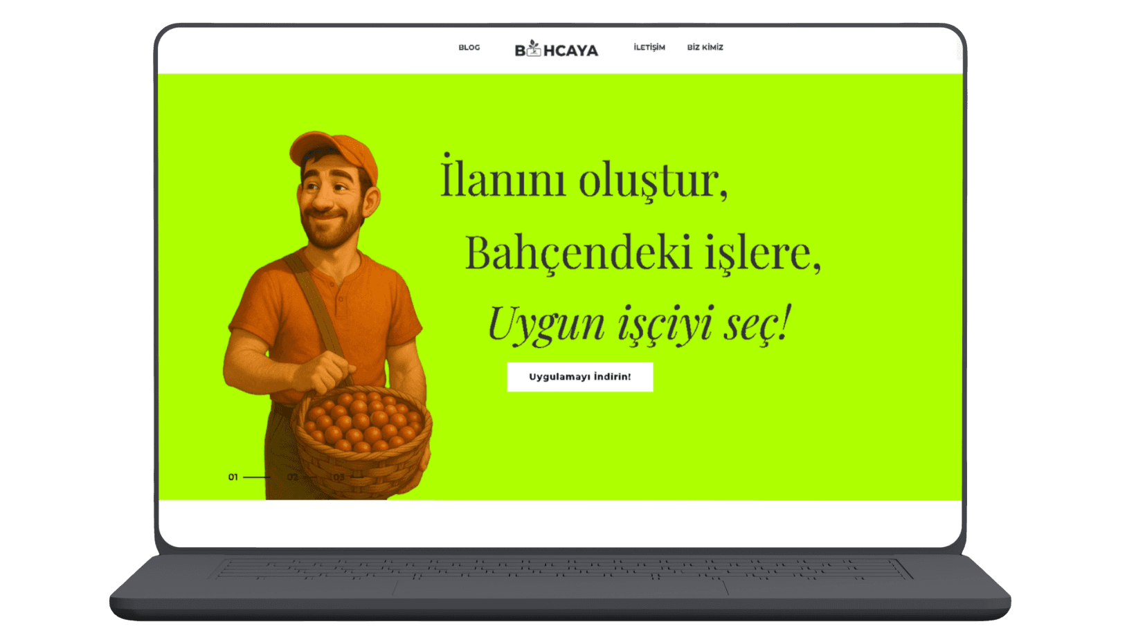
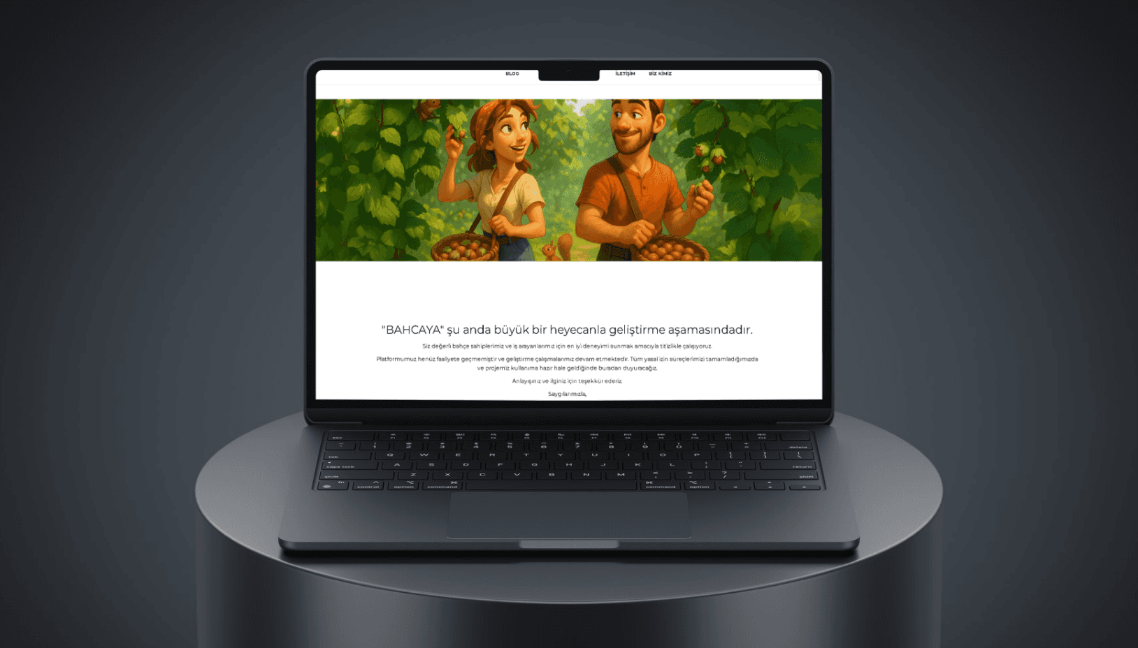
Bahçaya is a mobile app startup connecting farmers with agricultural workers bringing a traditionally informal labor market into the digital age. We designed and developed the website from scratch, then executed a full technical and on-page SEO strategy that pushed the site to the top of search results within two months, entirely without paid advertising.
(MY APPROACAH)
We approached this as two parallel problems: communication and discoverability. The site was designed to make the product's value immediately clear to two distinct audiences farmers and agricultural workers without relying on jargon or lengthy explanations. Simultaneously, we built the technical foundation for SEO from day one: site architecture, page speed, structured data, and keyword-aligned content targeting both branded and category-level searches.
(VISION & INNOVATION)
The goal was to give Bahçaya a digital foothold that could grow with the product. Rather than a temporary placeholder, the site was built to function as a long-term organic acquisition channel one that generates visibility and trust before the app even reaches full scale.
(CHALLENGES)
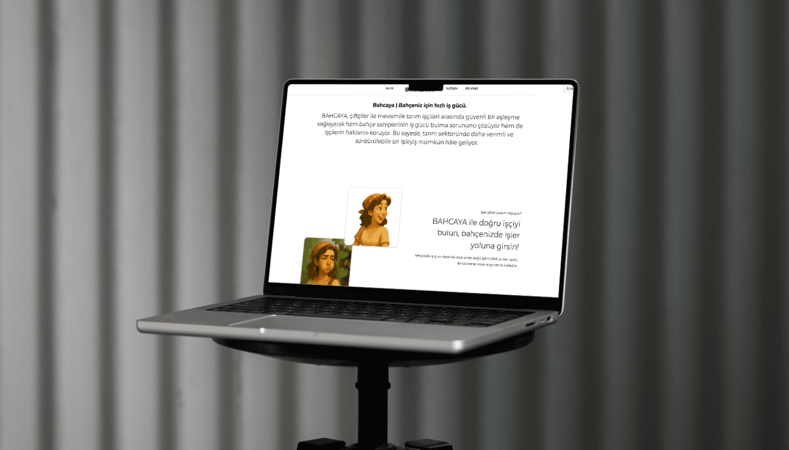
Working with an early-stage startup means working with uncertainty. Product details, positioning, and target messaging were still evolving throughout the project. The real challenge was designing and writing for a product that hadn't fully defined itself yet making decisions that would hold up as the startup matured, without slowing down the build. The site went live in one week.
(PROBLEMS)
As a startup operating in an early and undefined market, Bahçaya had no digital presence to validate its concept or attract its first wave of users. The challenge wasn't just building a website — it was building one that could communicate an unfamiliar product clearly, while also being discoverable by the exact audience the platform was built for.
(USER-CENTRIC DESIGN)
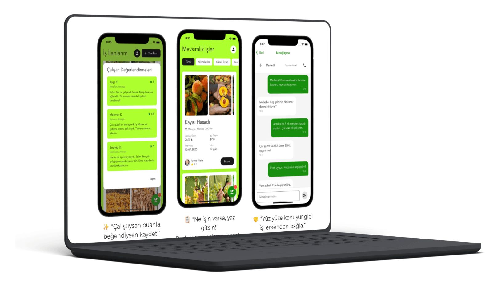
The site serves two distinct user groups with different motivations and levels of digital familiarity. Design decisions prioritized clarity over cleverness straightforward navigation, plain language, and a visual hierarchy that made the core value proposition impossible to miss, regardless of how the visitor found the page.
(USER NEEDS)
Farmers needed to understand quickly whether this platform would actually save them time finding reliable workers. Agricultural workers needed to see a legitimate opportunity, not another app promising things it couldn't deliver. Both audiences required trust signals, simplicity, and a frictionless path to the next step the app download.