Category:
Web Design
Client:
Operater
Duration:
3 days
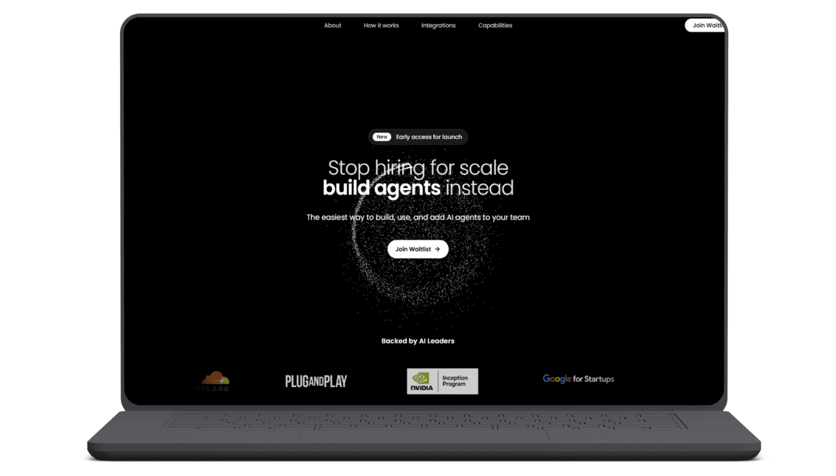
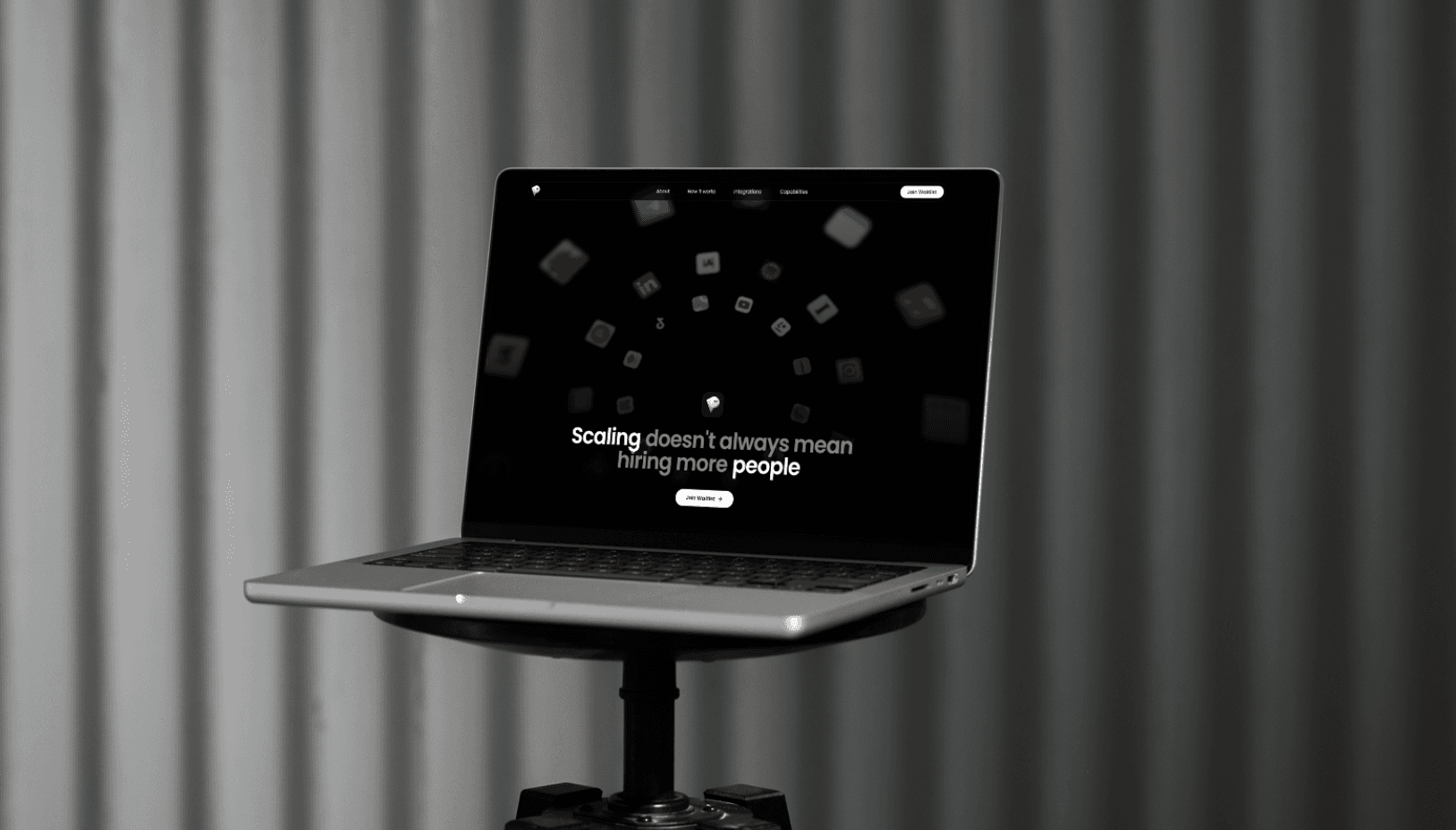
Operater is an AI agent platform backed by NVIDIA, Google for Startups, and Plug and Play. Their existing website no longer reflected the product's maturity it was text-heavy, lacked clear calls to action, and felt misaligned with where the brand had grown. We took full ownership of design and development to build something that finally matched the platform's ambition.
(MY APPROACAH)
We started by deeply understanding the product and its target audience fast-moving teams looking to scale without scaling headcount. From there, we structured the page around a single conversion goal: waitlist signups. Every section was built to answer one question at a time: what it is, how it works, what it connects to, and what to do next. Design and development ran in parallel, with animations serving the narrative rather than decorating it.
(VISION & INNOVATION)
The goal wasn't just a new website it was a repositioning. Operater needed a digital presence that could hold its own in front of investors, enterprise prospects, and early adopters simultaneously. The vision: a site that sells the transformation, not just the features.
(CHALLENGES)
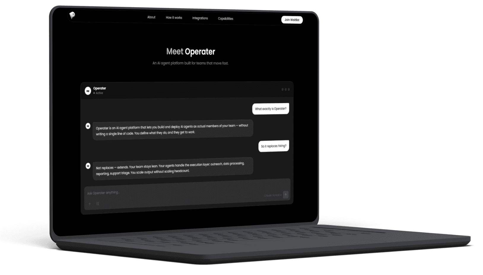
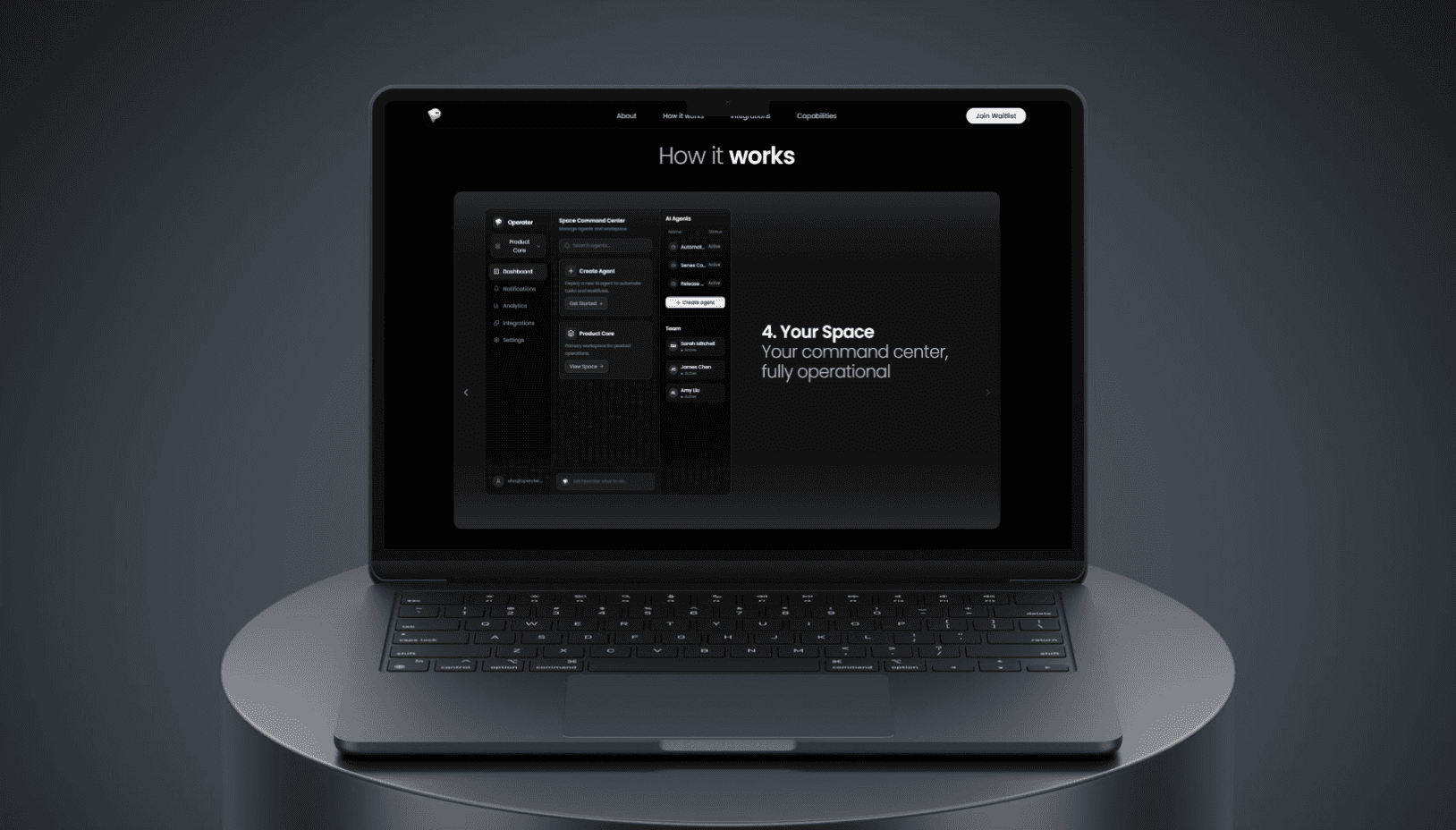
The most demanding part of this project was that we had also designed the product interface from scratch which meant the website had to represent the UI accurately without overexposing it. Finding the right balance between showing enough to build trust and abstracting enough to maintain clarity required precise judgment throughout the three-day build.
(PROBLEMS)
The previous site buried the product under dense copy with no clear path forward for visitors. There were no CTAs, no visual hierarchy, and no reflection of Operater's current positioning as a serious, investor-backed platform. The site was holding the brand back.
(USER-CENTRIC DESIGN)
Each section was sequenced to mirror the visitor's mental journey. Animations weren't added for effect they were used to guide attention and pace the scroll. The result is a site that feels effortless to move through, because every transition and visual cue was deliberately placed.
(USER NEEDS)
The target audience: technical decision-makers and team leads under pressure to scale efficiently. They don't have time to read they need to evaluate fast. The site was designed to answer three core questions within the first scroll: Does this solve my problem? Can I trust it? How do I start?